Color persuasion is one of the most instrumental components in design. It’s one of the driving forces in marketing that can establish brand recognition amongst consumers.
Design, however, is a spectrum of innovative pieces with each one working together to create the bigger picture. We’ve decided that this spectrum is too broad to cover in one article and want to dedicate our time to create a four-part series about the most essential moving pieces in design: color, aesthetics, personality, and messaging.
Understanding Color Theory
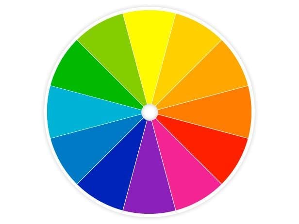
Color theory plays an integral part in today’s design world. Its purpose is to form a logical color structure to help designers understand how colors interact with one another. In 1666 Sir Isaac Newton invented the first color wheel, which appears as a circular diagram of colors. The color wheel consists of primary colors (red, yellow, blue), secondary colors (green, orange, purple, which are formed by mixing the primary colors), and tertiary colors (colors formed when mixing primary and secondary colors).
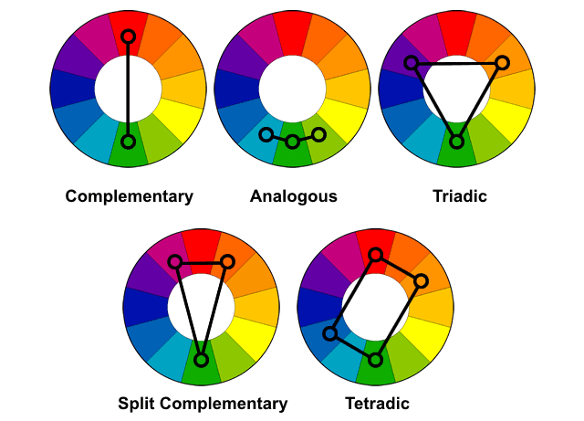
Color harmony is the next step in understanding color theory. Color harmony is the arrangement of colors in order to create a pleasant visual experience. This harmony can be accomplished through combining colors with several techniques: complementary, analogous, triad, split-complementary, rectangle, and square.
Color harmony is essential for designers to produce a color scheme to brand a company. The designers behind big name brands like UPS®, McDonald’s®, and FedEx understood the importance of color in design. Their color scheme implementation has contributed to each brand’s immense recognition amongst consumers. For example, Coca-Cola® has its very own Pantone formula that no other organization has access to. Coca-Cola®’s red is just one of the many differentiators for the brand. But aside from understanding colors themselves, designers also have to be aware of the psychological impact colors have on consumers.
The Psychology Behind Color Persuasion
“90% of snap judgments made about products can be based on color alone.” – University of Winnipeg datapoint.
Humans associate various feelings with individual colors, which is why designers have to understand color when it comes to branding. For example, black and white colors are associated with an image of power, which explains why innovative, luxury, or technological brands (BMW, Cadillac, Apple) primarily rely on these two influential colors in branding.
The most important thing to note is that color perception varies based on several determinants including age, gender, and location. While white may be perceived as a soft, calming color, it is viewed as the complete opposite in China or Japan where it can represent sorrow or death. Color serves as a subliminal language and it subconsciously connects with consumers.
People also tend to associate their personalities with specific colors. This is apparent when it comes to home decoration or purchasing a car. Children may decide to paint their rooms yellow since yellow resonates with children more than adults. An older woman may decide to paint her living room a light blue while her husband may want a bolder blue.
Also, consumers tend to favor colors depending on their personal preference. So, while it may appear that colors are universal, they are not. This is why it’s crucial for businesses to understand how consumers will perceive the brand’s products, services, or channels.
Emotions Associated with Various Colors
When it comes to choosing a brand’s color scheme, it’s critical that designers understand how each color will resonate with various target audiences. This can vary depending on the demographic or behavioral differences in consumers. However, it’s important to note that these ten primary example colors create an overall influence that affect most consumers in a similar way. We’ll go over the top ten colors used in marketing and their influence below:
Red – creates a sense of urgency, triggers powerful emotions, and encourages appetite. It is associated with movement, excitement, power, fearlessness, and passion.
Blue – trust, loyalty, dependability, logic, security, and serenity. Provides a sense of security and stimulates productivity. It is also known to be the preferred color of men.
Green – health, tranquility, growth, freshness, prosperity, hope, and nature. Used to promote environmental issues. Green can encourage balance and harmony.
Purple – commonly associated with wisdom, wealth, spirituality, imaginative, and sophistication.
Yellow – cheerful color that promotes optimism, warmth, happiness, creativity, intellect, and extroversion. Can be used to create a sense of anxiety that can draw in impulsive buyers and window shoppers.
Orange – creates a sense of courage, confidence, warmth, innovation, friendliness, and energy.
Pink – imaginative, passionate, caring, creativity, innovative, quirky. Often associated with femininity.
Black – associated with sophistication, security, power, elegance, authority, and substance. Often associated with luxury and power.
White/Grey – innocence, purity, cleanliness, simplistic, pristine. Represents cleanliness and can provide a modern feel.
Color Establishes Brand Recognition
It’s vital that companies use the same color scheme to set as the brand’s standards across all channels such as websites, socials, advertisements, and products. Doing so will further engrain the design of the company in the minds of consumers, which will result in an increase of brand recognition.
Consumers subconsciously rely on colors to help them differentiate the contrasts between brands. For example, when you picture an all red background with white cursive in front of it, do you picture the Coca-Cola® brand? There are scientific reasons behind why brands choose specific colors and it boils down to industry and consumers.
Nature Valley Bars feature yellow and green because green equates to healthy and yellow promotes a sense of happiness. Since the company’s mission is to stimulate excitement around healthy, easily accessible eating, the brand chose an ideal representative color scheme.
Research has shown that consumers prefer recognizable brands, which makes the color scheme an important differentiator in brand identity creation. It’s essential that the organization’s colors align with the brand’s personality to further instill the overall brand impression on the consumer.
The Power of Color Persuasion
Let’s go over how color can be effective in marketing. Take Harley-Davidson® for example. Since it’s a motorcycle company, the brand must give off a tough, rugged look that aligns with its personality. The organization takes this image one step forward by incorporating orange, black, and white into the brand’s guidelines. Black and white colors give off a feeling of power and strength while orange provides a feeling of excitement. This color combination is essential to the brand’s identity and overall purpose “to ignite the fire within people on the many roads.”
When choosing the colors to represent your brand, it’s imperative that they are chosen primarily to convey the brand’s image or personality. Apple understood its objective with its color scheme as the colors represent cleanliness, organization, innovation, and power.
Another tactic marketers use to their advantage is the isolation effect, which is the idea that something stands out more than others. In a study from The American Journal of Psychology, researchers prove that consumers are more likely to notice an object that contrasts against a different colored background. Think of a Coca-Cola® can or a bright red “subscribe” button on an all-white website.
Striving for a distinct color palette can make companies stand out from competitors. If a set of competitors are utilizing the same color scheme, it would be in an organization’s best interest to incorporate other colors that align with the brand. Taking advantage of the isolation effect can position a company over its competitors if used correctly.
Using color persuasion to grab the consumer’s attention can garner conversions whether for sales, likes, subscriptions, etc. This method should be in the back of designers’ minds when it’s time to appoint the brand’s color scheme. This is why fast food restaurants such as McDonald’s®, Wendy’s, and Chick-fil-A® utilize the color red. Red invokes a sense of hunger, which can drive a lot of sales when it comes to fast food. Consumers might see a bright red sign off the freeway, notice it’s calling for a quick bite to eat, think about how they might be hungry, and impulsively pull into the drive through lane.
Color persuasion is one of the many important aspects in any disciple of design. It can help emphasize the attributes of the brand’s personality, stye, and essence. For an aligned color scheme, it’s important to first understand the brand’s personality and tone.